Optimal way to design your landing page:
1. responsive design for full screens
This option let you define the design width to always fill 100% of the screen.
the height will stay proportional to the screen width, therfore if the screen width is small the height will get smaller also.
also, working with this option, relatively change the location and sizes of elements at the page.
you can define a minimal width in this option - that's mean that scrolling will be added to the page whenever the screen gets to the minimum width.
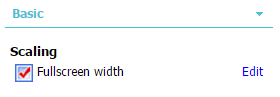
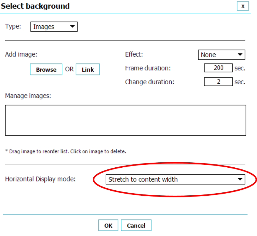
with this option 1920x930 will be the recommended design, and background image should set to 'Stretch to content width',and the scaling should be checked
example: http://mini-sites.net/fullscreen
2. Fixed size
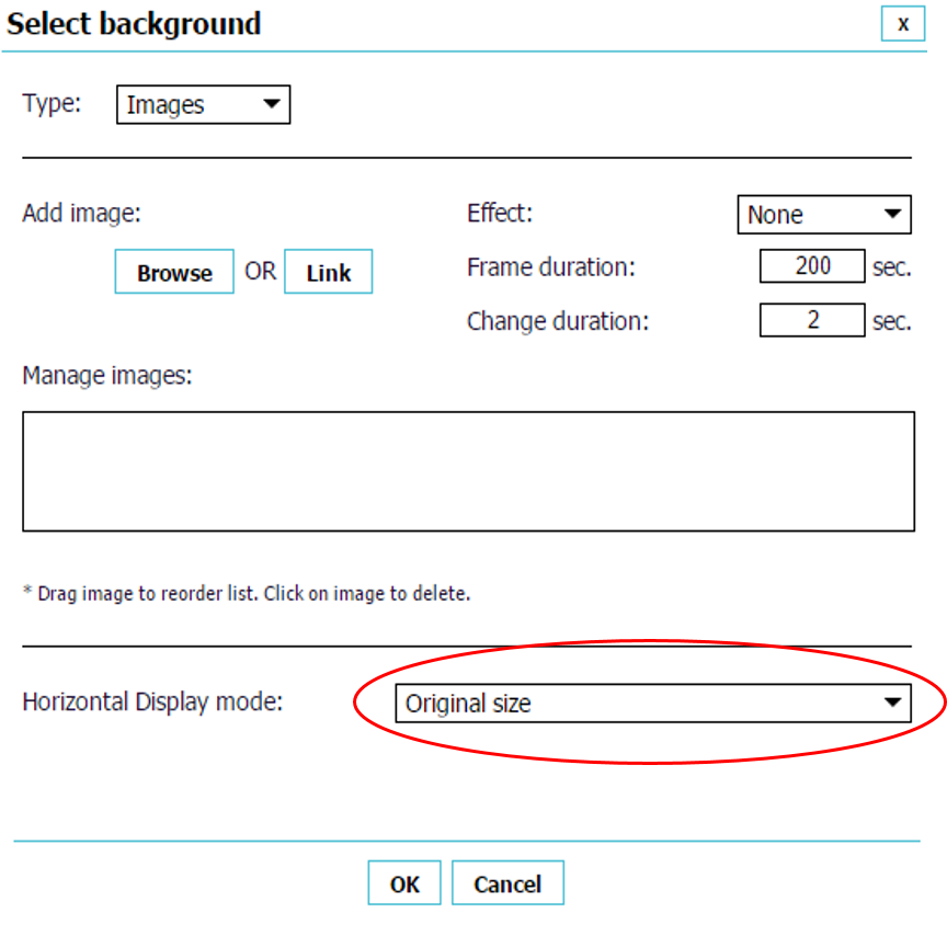
Fixed size design means that the page will look the same on every screen, and when screen resolution is is higher then the design size, the margin will be white. it's also recommend to design a fixed sizse page on 1260x680 resolution in order to get better results on wide scale of screens. at this option - make sure to uncheck the 'Full screen width' checkbox, load your background image and set it for 'Original size'.
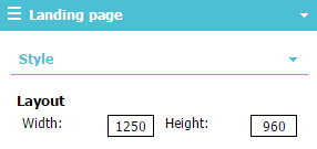
Note: If you wishing not to see the white margin on high resolution screens, we recommend to load an image with width of 2500 pixels, and set the
page width to 1250 pixel.
example: http://icreate.marketing/iCreate
3. Mobile design
After building your desktop version, you can duplicate all the content to mobile version,
and just adjust the graphic's size.
we recommend setting the screen size to 'Full screen width' and the screen width to 640 pixels, screen height will be set automaticly with content length.